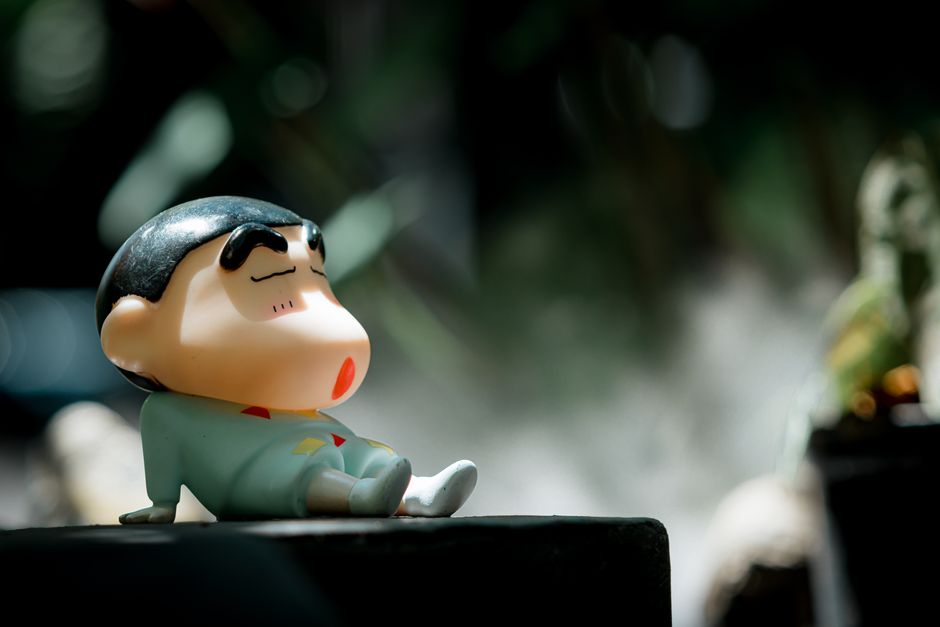
Why Do Bold Cartoon Faces Read Better Than Realistic Art in Tiny Icons?
In today’s digital age, tiny icons and avatars are everywhere — from Discord profiles and Twitch channels to mobile apps and online forums. Their size constraints make them challenging to design: what looks great as a full-size illustration can become unreadable, cluttered, or ambiguous when shrunk down to as little as 64x64 pixels or even smaller. This is why bold cartoon faces, especially those with simplified features and strong silhouettes, consistently outperform realistic faces for tiny face readability and cartoon expression clarity.
The Challenge of Tiny Icons on Mobile-First Platforms
With a massive shift toward mobile devices, most users encounter profile icons on small screens, often seen at a glance without zooming. Platforms like Discord are designed with this mobile-first mindset, where a user’s avatar is typically displayed as a small circle — frequently 32 to 64 pixels wide.
At this scale, details like subtle facial features or photorealistic textures quickly become noise. Instead, what matters most is instant recognition and easy readability, even under suboptimal viewing conditions, such as glare or dim light. This makes the principles of design for tiny icons crucial to understand and apply.
Silhouette Recognition: The Foundation of Icon Readability
One of the most important principles behind effective tiny avatar design is strong silhouette recognition. When an icon is shrunk to a small size, the overall shape or silhouette becomes the primary cue for identification — before any detail within the icon is discerned.
Why Silhouettes Matter
Consider how a Discord user’s circle avatar appears in a server member list. If the underlying shape is too intricate or blends into the background, the viewer struggles to instantly pick them out. Bold cartoon faces tend to use simplified shapes (round heads, clearly defined hair outlines) that are immediately identifiable, even at a small scale.
Realistic art often includes complex contours, subtle shadows, and detailed anatomy, which merge into an almost uniform blob when reduced. Cartoon-style icons avoid this pitfall by prioritizing clear, well-defined outlines that stand out visually.
Example Silhouettes for Reference
- Round or squared heads with clear separation from the background
- Exaggerated hairstyle shapes that create a distinct profile
- Minimal but expressive shapes for glasses, hats, or facial hair
Mobile-First Readability: Tailoring Design to User Context
You know what's funny? designing for mobile-first means considering several environmental factors beyond just size:
- Screen glare and reflections: Tiny details easily disappear under moderate glare. pfp consistency
- Quick glances: Users rarely stare at icons up close. They need immediate recognition.
- Variable display brightness: High or low brightness impacts how contrast and colors read.
Cartoon faces flourish here because they focus on the most important elements: bold and simple shapes, expressive outlines, and distinctive colors or contrast zones. Realistic art’s subtle gradations and detailed textures rarely survive these viewing conditions, often morphing into unhelpful noise.
Contrast and Separation: Making Features Pop in Tiny Avatars
Contrast between various elements within the avatar is essential for tiny face readability. When elements merge or blend, users struggle to decipher the image. Cartoon faces cleverly leverage high contrast and color separation to visually compartmentalize facial features.
Key Techniques for Contrast and Separation
- Flat colors or minimal gradients: Using blocks of flat color reduces visual confusion.
- Dark outlines: Thick lines around the face and key features emphasize shape even when details blur.
- Background separation: Avatars designed with a contrasting background color or halo effect prevent the icon from blending into the Discord UI or other surrounding elements.
- Color contrast in features: Eyes, mouth, and hair colors are chosen to stand out against the skin tone for immediate recognition.
Face and Expression Clarity: The Heartbeat of Cartoon Avatars
Faces convey identity and personality, even when tiny. Simplified cartoon expressions emphasize this by exaggerating key features such as eyes, eyebrows, and mouth shapes. This clarity of expression is far more readable at small sizes than realistic faces with subtle expressions.
Tiny text or overly detailed facial elements, common in photorealistic icons, become illegible or distracting noise. Instead, cartoon avatars focus on:
- Big eyes and clear eye shapes: Eyes are windows into expression and identity.
- Easy-to-read mouth shapes: Smiles, frowns, or open mouths are exaggerated for instant emotion recognition.
- Minimal nose and cheek details: Reducing mid-face detail avoids clutter without sacrificing character.
This approach enhances cartoon expression readability, making it simpler for the viewer to connect instantly with the avatar’s mood or personality.
Why Text and Busy Backgrounds Hurt Tiny Icon Readability
An important design caveat: avatars that rely on tiny text or busy backgrounds often fail on mobile and small screen platforms. Any text smaller than about 12 pixels typically becomes unreadable, and when combined with complex backgrounds, the entire icon visually “noises out.”
A bold, simplified cartoon face set against a plain or gently gradient background ensures the features stand out crisply and that the icon remains versatile across both light and dark modes — a vital consideration on platforms like Discord.
Testing Against Discord's Circular Crop and Color Modes
Discord crops avatars in a circle rather than a square, so it is essential to consider this crop when designing icons. Cartoon faces typically work better in circles because the clean shapes and strong contrasts maintain visual impact even at the edges.
Additionally, testing your icon on both Discord’s dark mode and light mode is critical. Cartoon avatars with clear silhouettes and contrasting colors tend to remain readable in both modes, while realistic icons may lose clarity if shadows or colors blend into the UI.
Summary: Simplified Features Drive Tiny Face Readability
Design Aspect Advantage of Bold Cartoon Faces Realistic Art Limitations at Small Sizes Silhouette Strong, clean outlines easily recognizable at 32-64px Complex shapes blend into an ambiguous blob Facial Features Simplified, exaggerated eyes and mouths read clearly Crowded, subtle details become indistinct or noisy Contrast High contrast between features and background ensures separation Realistic shading may lose detail in low brightness or tiny scale Expression Clear emotions via exaggerated cartoon features Subtle expressions can be lost or misread Background & Text Simple or flat backgrounds avoid visual noise Busy backgrounds and tiny text become clutterFinal Thoughts
If you’re designing avatars for Discord or any small icon use case, prioritizing bold cartoon faces with simplified features is your best bet for ensuring tiny face readability. Focus on strong silhouettes, high contrast, and clear expressions to make your icons stand out effortlessly on both mobile and desktop, in any UI mode.
Remember to always preview your designs in both light and dark https://dlf-ne.org/why-do-subtle-expressions-fail-in-small-profile-icons/ modes, and use circular cropping previews to simulate Discord’s real-world display conditions. With these best practices, your community’s avatars will be instantly recognizable, expressive, and visually compelling — even at a glance.
As a gaming community moderator and freelance illustrator, I’ve found that keeping a personal folder of good silhouettes for reference and committing to testing across multiple devices makes all the difference. Your avatar isn’t just a tiny picture; it’s a crucial part of your online identity.